There are different ways to let your visitors compare between your and your rivals’ product or between your new and your old product. For example, one way is to use a table to highlight which product has a certain feature by using a simple Green Tick icon or a Red Cross icon. We have a well-documented blog on that. Check out How To Create a Comparison Table For WordPress Using Elementor.
Filtering
If you are going to use a Table to let your visitors compare between your two products, you can also insert the option of Filtering for your Table. But that is not what this blog is going to tell you. This blog will show you how you can let your readers compare between two products using side-by-side images.
Image Comparison For Elementor
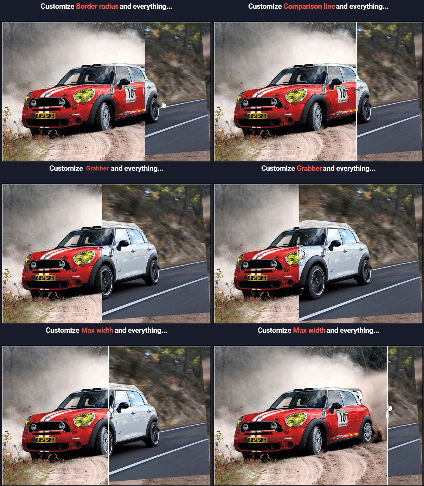
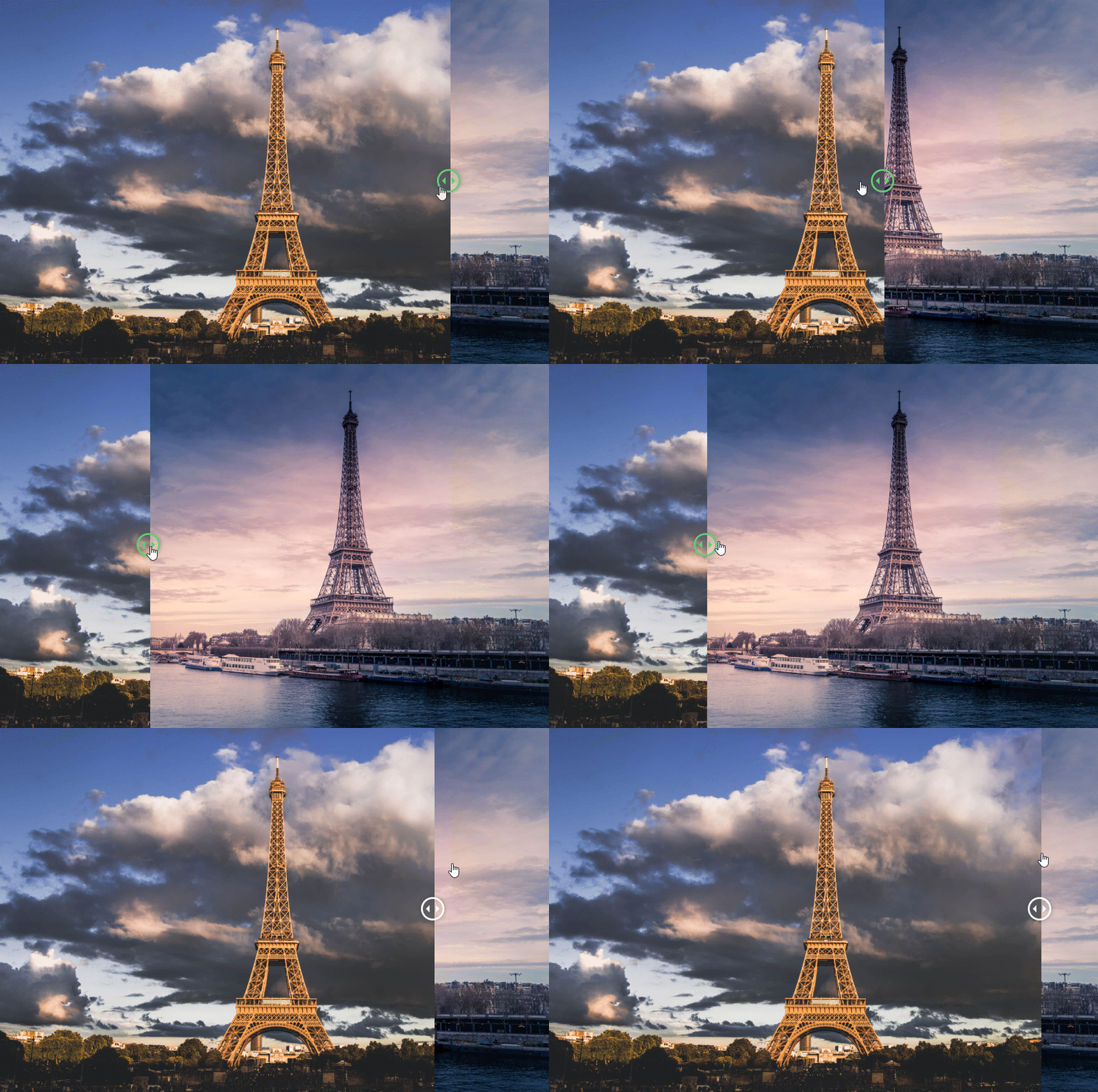
Image Comparison is the perfect method if the compared images are not identical. The EA Image Comparison element gives you a grabber which can be moved using your mouse. As your readers slide left or right, the image on the other side of the box will get visibility. You can see the gif below to get an idea.
Step-By-Step Create Image Comparison
Get Essential Addons
Essential Addons for Elementor is the most popular Addon Library for Elementor. It includes 50+ elements in its library. So, if you think about it, Elementor and Essential Addons give you 100 + elements to work with.
EA Image Comparison
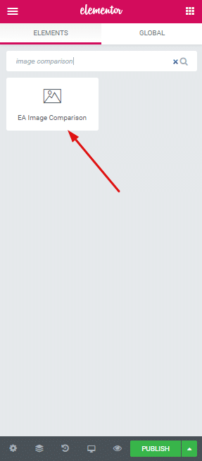
Okay, so after you install Essential Addons for Elementor, open your WordPress editor and launch the Elementor Editor. Look for EA Image Comparison element and drop it inside the interface.
Content For EA Image Comparison (Images)
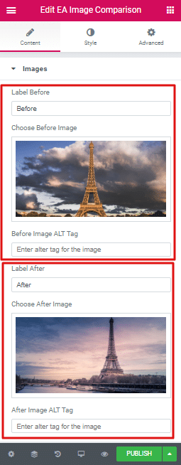
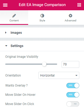
Okay now lets add content to the element. Head over to the Content Tab. You can add two images. Every image will have two other specification to them. You can set a Label and ALT Tag for both the images.
Content For EA Image Comparison (Settings)
The second Tab under the Content tab is Settings. We want my readers to activate the Grabber just at their mouse movement. So we will Toggle on the Move slider on Hover option.
Style For EA Image Comparison (Settings)
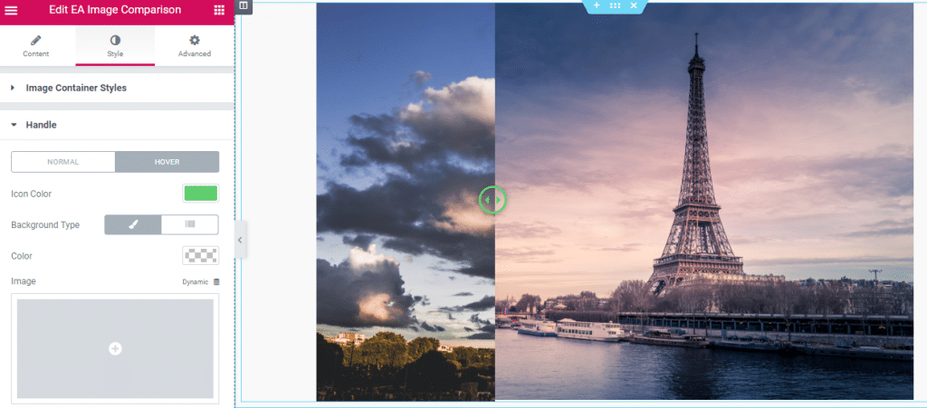
Now we do not want any divider between my images. So we will navigate to Style>Divider, and reduce the Width of it to zero. Also we want to highlight when the Grabber is active. We can do this by using a different color for when then Divider is active. So we will navigate to Style>Handle and pick Green as the Icon Color for Hover state.


