There are many sources from which one can take inspiration for web designs. You can generate Web Design ideas with Elementor. It comes with a handful of Templates, which is a great source of design ideas.
But, for this Blog we are going to look into 4 Wesbites listed on Awwwards.com. It is open-for-all platform where one can rank Websites based on their Design, Usability, Creativity, Content, Developer.

Identifying Tools
This blog has the primary objective of teaching you, how to recreate web-designs using no code at all. For this reason, we will first identify the elements of some of the wesbites listed on Awwwards.com. If you have already used Elementor, you know what elements are.
Afterwards, we are going to see which elements of Elementor can be used to recreate the designs. At the same time, we will see some better alternatives and complementary elements that come with Essential Addons, a top-notch widget library for Elementor.
Ready? Lets get going.
The first website we are going to look into is, Adobe 2018 Mobile Study. This Landing Page illustrates the importance of the next Mobile Decade.
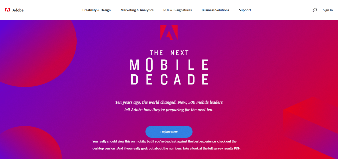
Once you are on the Landing Page you will see a CTA button, which loads the next page on the website. The very first few steps a visitor can take are limited and created in a layer.
The entire website is built on a long template. You need to scroll instead of navigating to a new page to see content. The background has a gradient fill. The most fascinating element on the website is the charts used to graphically represent some stats. You can include such an element on your website using no code with Progress Bar.
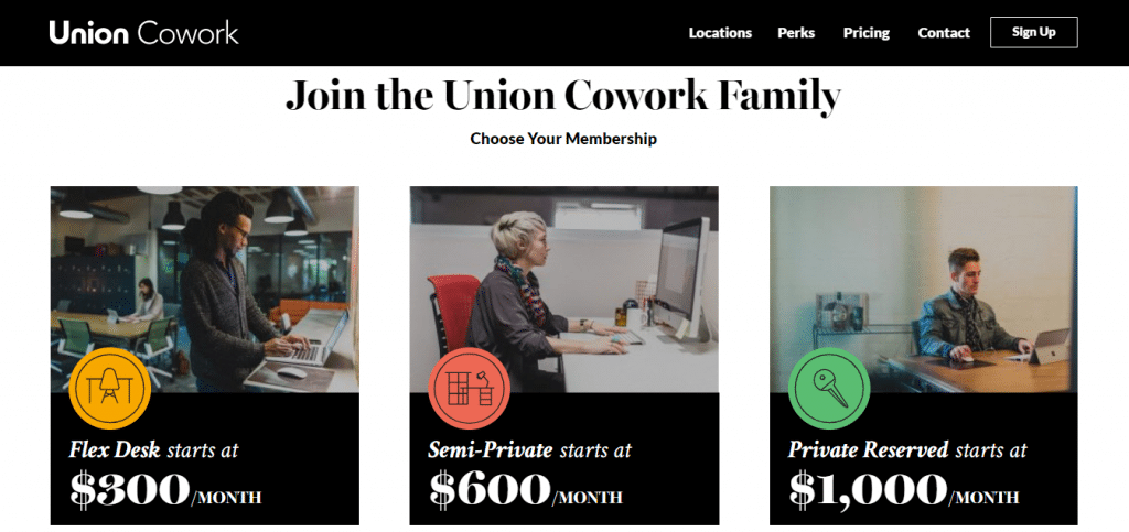
Union Cowork is a San Diego based business. The business leases office and industrial space in California and selected cities worldwide.
Their Landing Page is created using a long templates. The websites uses different color contrast to separate different parts of the long canvas. The very first part of the layout has a video as its background. This can be done using Elementor also. All you need to do is set the background of the Section as a Video and add other elements over it.
But lets focus on some other features of the Website. It has Info boxes, Maps and a subscription form at the very end.
- Menu Anchor Widget.
- EA Creative Buttons.
- Image Box Widget.
- EA Form Elements(Contact Form 7, weForm, Caldera, Ninja and Gravity)
- Pricing Table (Pro)
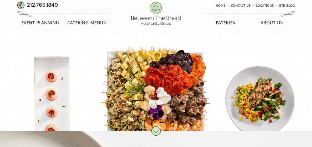
The founder of this restaurant wanted to reinvent meal in a corporate setting.
The website is full of colorful images, CTA Buttons and several interactive Sections. You can also make your websites interactive by using simple Hover effects.
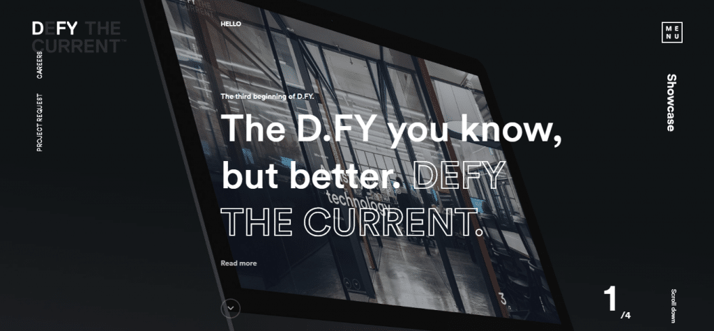
DFY provides all kinds of Digital Services. This agency does Branding, Promoting, Service Prototype and so on. It believes that one can not generate creative ideas simply by following trends.
On their website, http://www.dfy.co.kr/, they host their portfolio. It uses the same dark background upon which additional elements are added.
Their Landing Page displays simple one word instructions, CTA buttons, Navigation Menu and a nice Background to fuse it all together. As soon as you click on the Navigation Arrow, it jumps to the next slide.
Do you want us to address any specific web-design idea? Please let us know in the comments section. In the meantime why not read a blog on Why Should You Write Blog Posts Using Elementor.



1 thought on “Recreate Website Design with Elementor and Essential Addons”
Hi AKASH and readers,
please check our Blog page: https://letswp.io Created with Elemementor Pro.
Thanks.