With the release of WordPress 5.6 ‘Simone’ this December, WordPress continues its long standing tradition by introducing Twenty Twenty-One, a new default theme for the users.
Table of Contents
As you may already know, WordPress 5.6 comprised an all-women release squad and released some stunning features.
The contributors from different countries along with several enthusiastic volunteers, have worked tirelessly to bring us Twenty Twenty-One, a brand new default theme for WordPress. Featuring a minimalist yet sophisticated design, Twenty Twenty-One is a flexible, versatile theme that prioritizes accessibility, and can be easily customized by WordPress users of varying skill levels. Let’s find out more about the new theme below.
Deep Dive Into Twenty Twenty-One: An Elegant, Accessibility Ready Default Theme For WordPress
![[Review] Twenty Twenty-One: New Default Theme For WordPress 1](https://assets.wpdeveloper.com/2020/12/2021-theme-1-1.png)
Twenty Twenty-One has been designed to be simple and elegant, but with all the features you could need to create a stunning website with the block editor. You can use this theme to truly explore the design possibilities with the Gutenberg editor.
What’s more important is that this new default theme has incorporated design decisions that comply with relevant accessibility guidelines from WCAG 2.1 level AAA. This will help your website meet the most specialized, international accessibility standards.
The WordPress community has always been an inclusive and diverse community, and the Twenty Twenty-One theme takes us one step further in that direction by improving the accessibility for your website.
This theme also comes with support for several new block and theme features such as default block styles, dark editor styles, color palettes, post formats, HTML5 tags and much more. Let’s find out more below.
Pretty In Pastels: Beautiful Color Palettes For Your Website
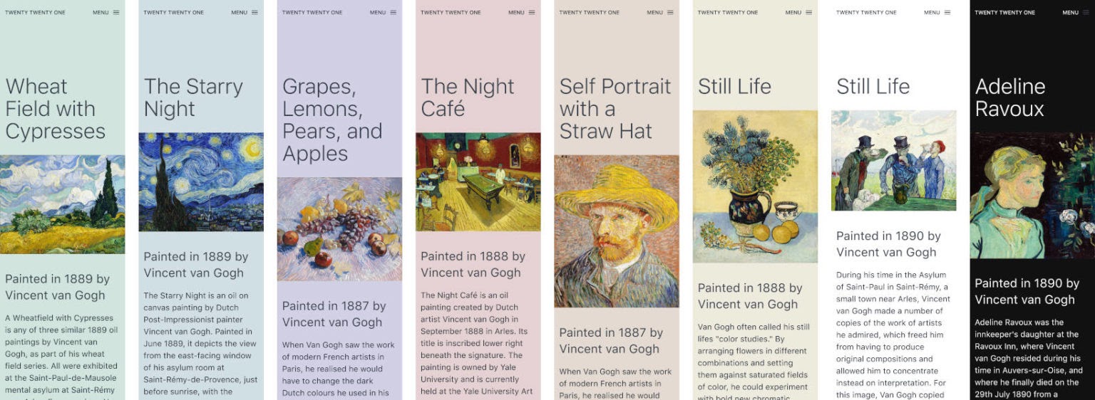
Twenty Twenty-One theme comes with a stunning and soothing color palette in soft shades of pastels. Pastels and muted colors are quite popular at the moment, and they can give your website a sophisticated, refined appearance, but you can always customize the theme and use any color combination that you want.
These pre-selected color palettes are in compliance with AAA standards. You have the freedom to choose your own background color for the theme, and the theme will automatically choose contrasting, accessibility-conscious text colors for you.
If you’d rather choose your own color palettes for the text and the background, you can do that easily from the color picker as well.
Introduction Of Dark Mode Opt-in
This is the first time WordPress default theme has included Dark Mode support opt-in setting. With Twenty Twenty-One, you can configure the theme to make it respect device settings. This means that if your site visitor’s device settings are set to dark mode, then you can make your website respect the device settings by enabling the option in the Customizer.
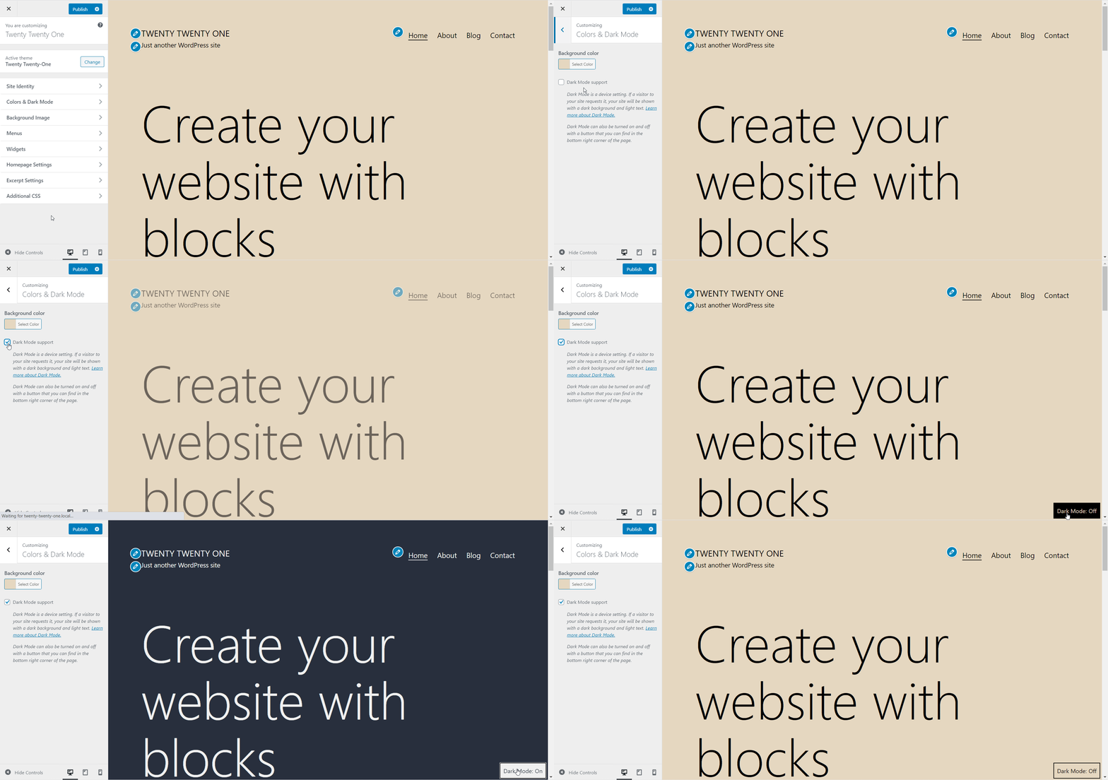
By making Dark Mode optional, users get more flexibility when using the Twenty Twenty-One theme to build their websites. This is also an important step towards accessibility, as many users find it difficult to read text against light backgrounds.
New Block Patterns With Twenty Twenty-One Theme
Block patterns were introduced with the release of WordPress 5.5, and with the Twenty Twenty-One theme, you can fully explore the design possibilities with these patterns. Twenty Twenty-One is the first default WordPress theme that comes with several stunning premade block patterns.
You can now overlap one block into another while designing your website to create unique, mixed content. Or, you can overlap multiple images on your web page, each with different border styles to create a stunning gallery.
These amazing block patterns will help you make your website stand out from the crowd. At the moment, these block patterns are only exclusive with the new default theme, so you will only be able to use them if you have the Twenty Twenty-One theme installed.
Improved Styling & CSS Custom Properties
As mentioned earlier, the new Twenty Twenty-One theme uses a modified version of the Seedlet theme as its base. As the Seedlet theme was completely built on CSS custom properties, Twenty Twenty-One will also give users access to a thorough system of nested CSS variables. This makes it easier for theme developers to build child themes and highly customized websites using Twenty Twenty-One.
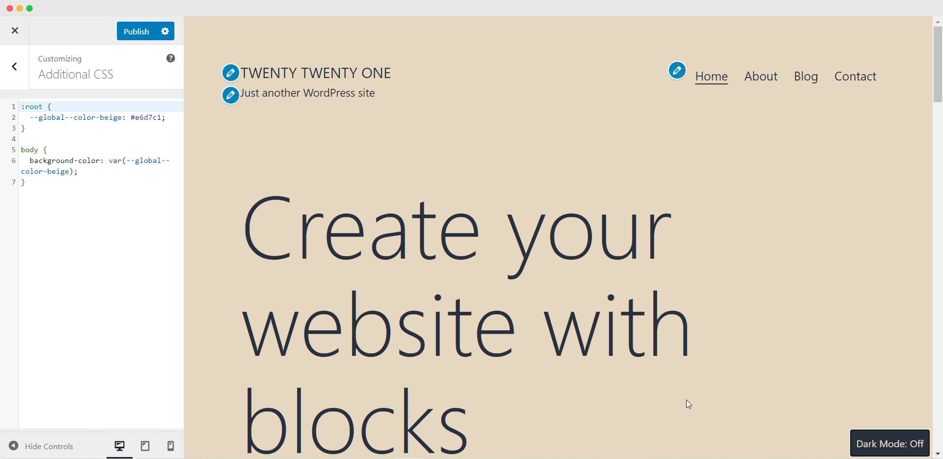
Even if you are not an advanced theme developer, you can still use Twenty Twenty-One to customize your website more swiftly with the improvements in style and CSS patterns. For example, you can add custom CSS to change the background colour of your website to anything you like as shown above.
Support For Two Navigation Menus
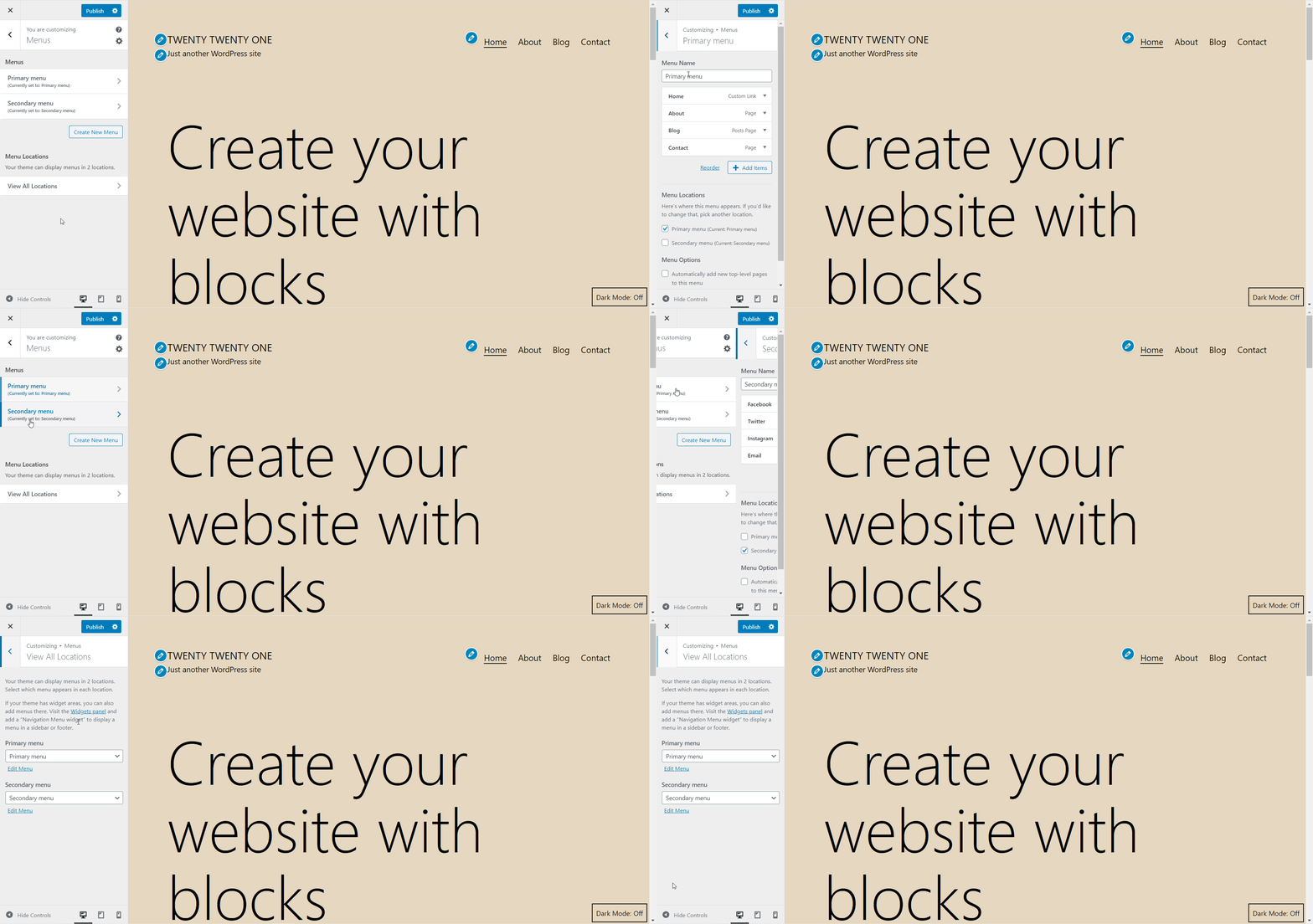
The new Twenty Twenty-One theme comes with only two navigation menus, thus giving your entire website a simple, streamlined appearance. One is the Primary Menu, which is located in the header’s top right corner, and the other is the Secondary Menu, which is placed at the footer and designed to be mainly used as a social menu. When you add links to your social media accounts in the footer section, the links are automatically converted to the appropriate social media icons.
Nine Different Post Formats For Creating Unique Content
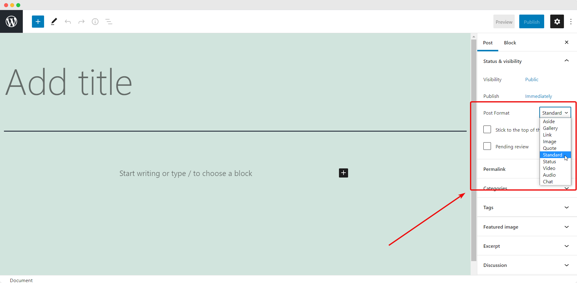
Another amazing feature about the Twenty Twenty-One theme is that it supports nine different post formats, including ‘link’, ‘aside’, ‘gallery’, ‘image’, ‘quote’, ‘status’, ‘video’, ‘audio’, and ‘chat’. This gives you greater flexibility when creating unique content to make your website stand out.
Native System Font Stack To Help Reduce Load Time
By default, the Twenty Twenty-One theme uses a native system font stack. This has been done intentionally to help reduce the load time, and to make it easier to create child themes. Besides this, using a native system font stack will also help make this theme more versatile so it can be used for different types of websites.
Few Limitations Of The Twenty Twenty-One Theme
Of course, there is no such thing as a perfect or flawless theme. Although Twenty Twenty-One is an amazing default theme to kick off the coming new year, there are some issues that users have reported after this theme was released.
The Design May Seem Too Simple And Bare
Although this theme was designed to have a minimalist appearance, for some users the design may come off as being “too simple” and there may be excessive white space when some content or blocks are removed. If you enjoy minimalist designs, this may not trouble you. But for other users, Twenty Twenty-One may seem a little too plain.
![[Review] Twenty Twenty-One: New Default Theme For WordPress 2](https://assets.wpdeveloper.com/2020/12/screely-1608532373431.png)
Missing Hamburger Menu On Smaller Devices
One of the most frequently asked questions in the support forum for Twenty Twenty-One theme seems to be about the lack of a hamburger menu for mobile and other small devices.
A hamburger menu is a clickable icon consisting of three horizontal lines that opens up your navigation menu on small screen devices like mobile phones or tablets. Without this menu, it might be difficult for site visitors to explore a website that uses Twenty Twenty-One theme on smaller devices.
Final Verdict: Should You Choose Twenty Twenty-One?
![[Review] Twenty Twenty-One: New Default Theme For WordPress 3](https://assets.wpdeveloper.com/2020/12/screely-1608532836238.png)
The new default Twenty Twenty-One theme may have some limitations, but it is still a beautifully designed, minimalist theme that is friendly for WordPress users of all skill levels as well as for developers interested in creating child themes. More importantly, this is a default theme that prioritizes accessibility, and can help you create a website that is readable and accessible to all groups of people.
At the end of the day, different people will have different preferences when it comes to the design, layout and usability of a WordPress theme. But all things considered, Twenty Twenty-One is definitely an amazing theme to kick off the coming new year with. It is versatile, flexible and is the perfect choice for users who want to explore their creativity with block patterns and the Gutenberg editor.

Have you tried the Twenty Twenty-One theme on your website? Share your experience with us in the comments below. For more WordPress related news, tutorials, and updates, make sure to subscribe to our blog or join our friendly Facebook Community.

