Are you looking for some Slider design ideas? Elementor comes with a ‘Slides‘ elements that you can use to create amazing Sliders for WordPress Landing Page.

Sliders are useful not only for presenting content in an interactive way, it can be used with CTA buttons to trigger action from your visitors as well. Luckily, the Elementor Slides element comes with the perfect Slide layout which includes space for a Text, Description and also a CTA button.
For this blog we are going to use the Slides element to recreate a certain Website.
Create Sliders for WordPress Landing Page
The CBS website includes a fine Slider on their Home Page. Feel free to visit their website and try it out for yourself and then come back because we are about to recreate it.
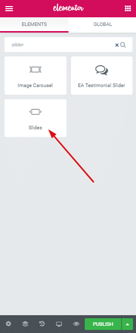
The Sliders include text at the left side of the screen and that’s for every slide. The right side is reserved for the image content that is also for every slide. Lets create this layout first. Head over to your Elementor Side panel and search for the ‘Slides‘ element.
Add the Image
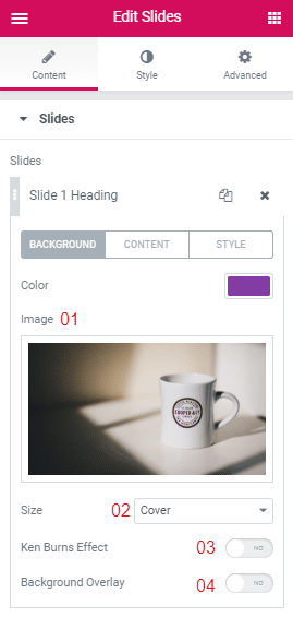
Pick an image from the Media Library or upload a new one. Keep the Image Size to Cover. And lastly keep both the Ken Burns Effect and Background Overlay disabled.
Adjust Content
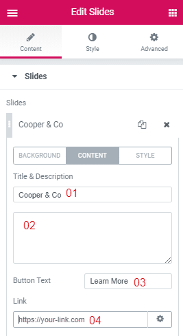
Give a Title to the Slide. I have not included any Description, but if you are intending to add some, the big box with the number 02 placed beside it is for adding description.
I have changed the Button Text to ‘Learn More’. And lastly you can add links to a certain Web-page in the Link field, i have placed number 4 right beside it.
Adjust the Style
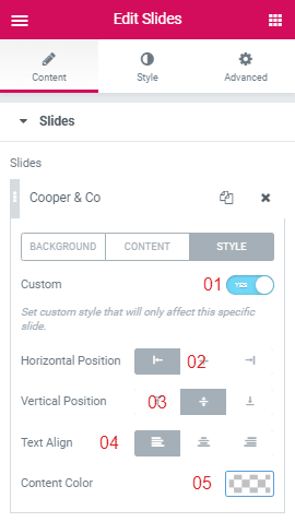
Move on to the next tab-Style. First you need to enable the Custom feature on. Next I have picked the Horizontal Position at the Left, Vertical Position at the Middle and Text Alignment to the Left. Although I have kept the text color to its default white color, you can change it by using the Text Color Pop-up.
Slider Cards
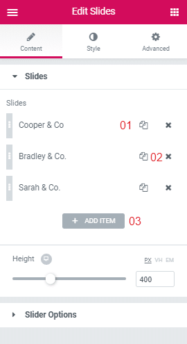
Make these adjustments to every Card you include. If you don’t know what a card is here is a simple explanation, every Slide you include from the Slide’s Content>>Slides Tab, it will be represented in a Card. The card holds all the customization options for the Slides.
01- Use this button to duplicate an existing card.
02- Use this button to remove a card.
03- Use this button to add a new card.
Create Interactive Slides
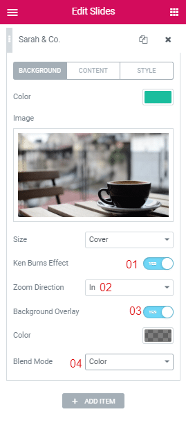
You can turn the simplest of Slides into an interactive one by turning on the Ken Burns Effect.
01- Turn on the Ken Burns Effect.
02- Set a Zoom Direction for the Effect.
03-Turn on the Background Overlay.
04- Pick a Blend Mode from the Drop-Down.
Adjust The Navigation
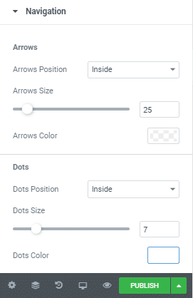
Navigate to Style>>Navigation. From here you can adjust the styling for both the Navigation Dots and Arrows.
Wrapping Up!
Do let us know what other design ideas you come up with for the Slides element. Here is an idea for further experimentation with the Slides element, try it in combination with different Elementor Blocks. It will definitely help you generate more creative ideas. Cheers!


