Do you own an online store of any kind and find that despite attracting traffic, your visitors are not converting into customers? The complexity of your checkout process may be the culprit behind this low conversion rate. However, fear not, there are numerous tips and tricks for checkout page optimization that can streamline the purchasing experience for your customers. This blog presents a comprehensive guide outlining these optimization strategies. Let us dive in.

🌟 What Is Checkout Page Optimization?
Checkout page optimization involves improving the design and user experience of your online store’s checkout process. In other words, it is about making it easy and smooth for customers to buy things from your website. The aim is to simplify the purchase process, making it easy and stress-free.
Ultimately, the goal is to boost conversion rates and increase revenue for your business. You have probably experienced optimized checkout processes while shopping online, even if you did not realize it at the time.
🌟 Why Do You Need to Optimize Your Checkout Page?
Every customer who completes a purchase helps your business make more money. Think of it like this: if you imagine a sales funnel, the last step—when customers actually buy something—is the trickiest. Optimizing your checkout page is like having a superpower to boost your sales and get more people to buy from you.
However, by making your checkout process smoother and reducing the number of people who abandon their shopping carts, you can make a big difference in your profits over time. So, every little decision you make about how your checkout works is a chance to drive customers toward making a purchase.
So, you should focus on making it as easy as possible for them, and you will see great results in the end. Otherwise, your cart abandonment rates will rise significantly.
🔎 What Is Cart Abandonment And When It Occur?
Cart abandonment happens when customers add items to their cart but do not finish the purchase. One big reason for this is the complicated checkout process. According to a study by the Baymard Institute, 17% of online shoppers abandon their carts because the checkout process is too complex.

Other reasons include having to create an account, unexpected costs like shipping and taxes, a slow checkout, and not trusting the website. But do not worry! Even if your checkout process is not working well, there are things you can do to improve it.
All being said, we are going to share 8 simple tips to make your checkout process smoother and boost your sales. Let us jump right in without delay.
🏅 Top 8 Checkout Page Optimization Tips to Improve Conversion Rate
To improve the user experience & conversion rate of your eCommerce business, you definitely need to optimize your checkout process. If customers find your checkout process easy, they will return again to buy more products from your store. Following are a few tips for you to make your checkout page optimization easy.
🚀 Encourage Quick Checkout by Creating a Sense of Urgency
The first tip would be motivating visitors to finish buying and avoid leaving items in their cart by making them feel like they need to act fast. Plus, explain why buying now is better than waiting further. To make people feel like they need to act quickly, show them a discount or offer that is only available for a short time, like 20% off.

Moreover, you can also show there is limited stock or spots left by saying things like, “Only a few left” or “Spots are filling up fast!” When people feel like something is running out, they are more likely to buy it before it is gone. But make sure one thing, do not imply these tactics too much because it backfires sometimes.
🎯 Make Your Checkout Button Noticeable And Appealing
Without a clear and attractive CTA of your checkout, checkout page optimization will be difficult. A clean checkout button makes it easy for visitors to purchase stuff. Customers should know exactly what to do when they are ready to purchase.

So, you need to make your CTA button (e.g., Buy Now) stand out by using a different color. You can also make it unique with fancy fonts, shapes, or other eye-catching styles. And put your checkout buttons where people can see them right away, without needing to scroll down the page.
⚠️ Remove Any Pop-ups or Distractions That May Disrupt the Checkout Process
When it comes to helping customers buy things, it is usually best to make the process as easy and quick as possible. Even though pop-ups and other fancy website features might seem helpful for gathering info, they can actually make buying stuff online more confusing, especially on mobile devices.
Extra stuff on the screen can make it harder for people to finish their purchases, and they might give up and leave without buying anything. So, think carefully before adding pop-ups. Focus on making the product pages look neat and tidy instead.
🌟 Opt For a Single-page Checkout Whenever Feasible
To make your eCommerce checkout better, keep it simple and put everything on one page. People want things fast when they shop online. If it feels like a hassle, they might just leave without buying anything.

However, according to Statista, 17% of people leave their carts because the checkout takes too long. So, trim down those forms and aim for a quick, one-page checkout to keep customers happy and buying.
📈 Show Customers the Progress of Their Checkout
If your online store needs more than one page for checkout, it is important to tell customers what to expect. You can do this by showing a progress bar or page counter. These let customers see where they are in the checkout process and how much more they have to do.
For instance, if there are three pages to fill out, knowing you are on page two can make it easier to finish. A progress bar on the checkout page is like a guide that can prevent cart abandonment on a large scale.
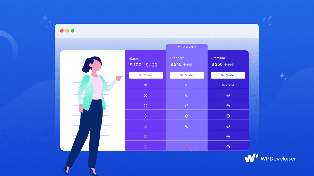
💳 Give Customers Various Payment Options to Choose From
Having various payment options is a must for checkout page optimization, making it easier for customers to buy from you. Statista research shows that 9% of cart abandonments happened due to not having multiple payment methods while making the purchase decision.

However, along with a single-page, distraction-free checkout process, you need to ensure that you are offering various payment gateway so that customers easily can pay through their preferred payment systems.
🖱️ Enable One-Click Payment for Faster Transactions
Another tip for checkout page optimization is enabling one-click payment. This means customers only have to enter their payment and shipping info once. After that, they can just click once to buy something. Simplifying the checkout process makes it more likely that customers will finish their purchases. With one-click checkout, customers are more likely to come back and buy again, making it a great tool for online stores.
👉 Allow Customers to Checkout As Guests without Requiring Account Creation
Did you know that one of the biggest reasons behind abandoned carts is that some websites do not let check out as guests? Business owners often want lots of customer info for future marketing, but some visitors prefer a quicker, hassle-free checkout as a guest.
This option lets them buy without making an account or getting more emails from the company. Offering guest checkout can boost your website’s sales by making it easier for customers to complete their purchases.
✅ Checkout Page Optimization: Simplify, Streamline, Succeed
A smooth checkout process can make or break an online sale. By optimizing your checkout page, you are not just simplifying the purchase journey for your customers; you are also boosting your chances of turning visitors into loyal customers. From creating a sense of urgency to offering multiple payment options and enabling one-click checkout, every step you take toward optimization is a step toward increased conversion rates and revenue.
So, do not let complexity be the downfall of your sales funnel. To get more eCommerce success tips, subscribe to our blog & join our friendly Facebook community.