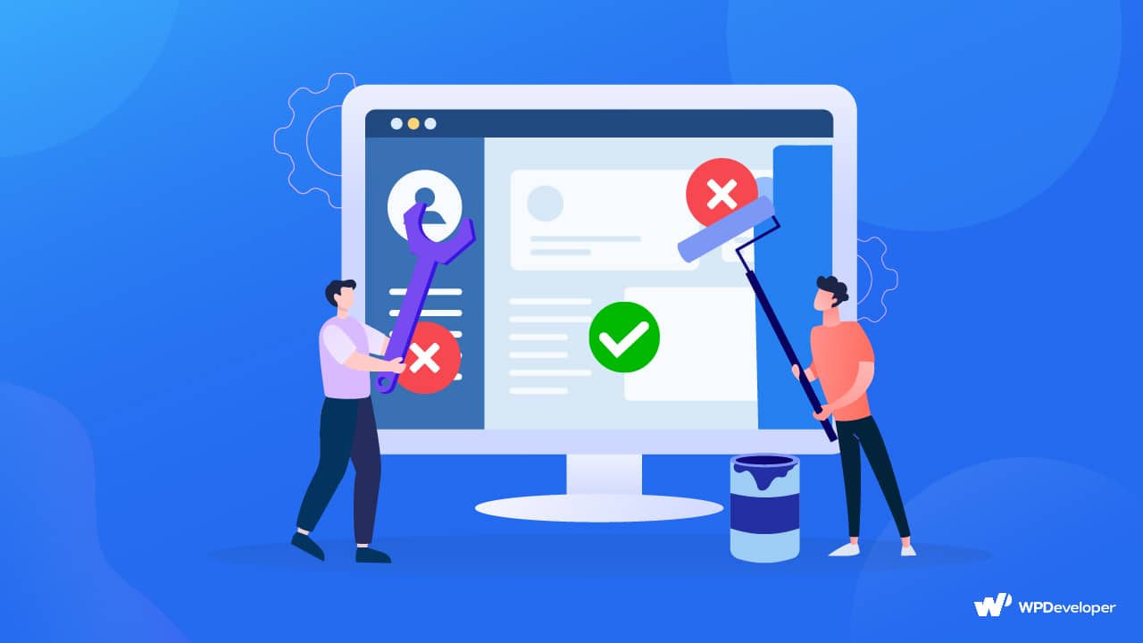
A slight error in website design can cause big problems in tracking new visitors, onboarding new customers, etc. The problem is, when we don’t know enough about designs, we can’t see what’s wrong or what needs to be fixed. Our goal today is to highlight the most common website design mistakes that we make and how to avoid them using stunning yet simple techniques.
Why Should You Emphasize On Your Website Design?
Emphasizing your website design is crucial to providing a positive user experience, creating a strong brand identity, optimizing conversions, improving search engine visibility, and gaining a competitive advantage in the digital realm. It is an investment that can yield long-term benefits and contribute to the success of your online presence. Here are some prime reasons you should take a look:
For A Better User Experience (UX)
A well-designed website enhances the overall user experience, making it easier for visitors to navigate, find information, and accomplish their goals. A positive UX encourages users to stay longer, explore more, and increase the likelihood of conversions, such as making a purchase or submitting a form.
Keep Visitors From Their First Impression
Your website’s design is often the first impression users have of your brand or business. A visually appealing and professional design builds trust, and credibility, and establishes a positive perception of your brand. It can differentiate you from competitors and leave a lasting impression on visitors.
Skyrocket Your Conversion Rate
An effective website design incorporates conversion-focused elements and strategies. By strategically placing call-to-action buttons, optimizing forms, and guiding users through the conversion funnel, you can improve conversion rates and achieve your website’s goals, such as generating leads or driving sales.
Optimize Website For Better Search Ranking
Website design plays a role in search engine optimization. Search engines consider factors like website speed, mobile-friendliness, and user experience when ranking websites. A well-designed website that loads quickly, provides a positive user experience, and follows SEO best practices is more likely to rank higher in search engine results, increasing visibility and organic traffic.
Get Competitive Advantage From Others
In a crowded online landscape, a visually appealing and user-friendly website can give you a competitive edge. A well-designed website attracts and engages users, sets you apart from competitors, and positions your brand as modern, professional, and trustworthy.
4 Web Design Principles To Always Follow
Mistakes happen when we fail to follow design principles. But what are the core principles of web design? Effective web design centers on four basic principles: contrast, repetition, alignment, and proximity. In every design, these are present. Let’s have a brief look at them:
Contrast
The objective is to make each element in a design stand out when it incorporates numerous of them (for example, font, color, size, line, shape, and thickness). People are interested and drawn in by the contrast or difference (right). Because of this, contrast is frequently regarded as the most crucial design principle.
Repetition
Designers can generate relationships, develop organization, and reinforce unity by using repetition. As demonstrated by this Asian-inspired theme, any number of elements, such as: Fonts, sizes, shapes, colors, textures, line thicknesses, graphic ideas, and spatial relationships
Alignment
Professional designers never arrange things randomly. Every component should somehow relate to every other component. A clean, posh appearance is produced through alignment. It may also occasionally imply an informational hierarchy. As with the bottom row of windows, elements out of alignment can be startling.
Proximity
Items become one visual entity rather than multiple distinct entities when they are grouped or placed close to one another. Proximity provides people with a clear structure, eliminates clutter, and helps organize information. As an illustration, rather than seeing a collection of random shapes while viewing a photo of a stained-glass window, you will see a series of concentric circles.
10+ Website Design Mistakes to Avoid & Solutions [2025]
If you are worried about which mistakes are made in your website design, then we are here to rescue you. We have listed down the most common website design mistakes we make and how we can fix them. Let’s hop in.
1. Navigation Layout Is Poorly Designed
Numerous typical web design errors stem from skipping the crucial steps of brainstorming, creating a sitemap, and wireframing. The menu and navigation system’s bad configuration is one of the obvious ones. Being forced to scroll through webpages with haphazardly arranged navigation might turn people away from websites. If you’re developing a website with a lot of pages, it makes sense to categorize them and arrange them hierarchically so that users can easily traverse the website. Additionally, navigation differs depending on the device. Despite the fact that there are numerous methods to use navigation, we rarely develop a responsive navigation bar. This is why we are losing so many prospective clients daily from many platforms.
![10+ Website Design Mistakes To Avoid In 2025 [With Solutions] 1](https://assets.wpdeveloper.com/2023/07/image-4.jpeg)
Solutions To Fix Navigation Bar
- Make the hypertext on your website obvious; use a different color, boldface, or underlining to distinguish a hyperlink from regular text.
- Sidebars shouldn’t have the same design as the website’s main content. It should be noticeable.
- When naming the hyperlinks, take a straightforward and concise method.
- Verify that the website’s navigation is mobile-friendly.
- Only use buttons for Calls to Action.
- Check how your users are browsing the website using evaluation tools.
- Ensure that visited links’ colors change so users can see where they are and where they’ve been.
- Refrain from utilizing animation that rolls, bounces, or moves while visitors are trying to read content on your website.
2. Not Making Website Responsive For All Devices
To provide an omnichannel experience, the design must be responsive and uniform across browsers and devices. The creation of distinct user experiences and roadmaps for various platforms and devices is one of the major web design errors made during the construction of websites. The goal should be to keep things as uniform as possible across all platforms.
Non-responsive design may have a variety of detrimental effects, including:
- Driving higher expenditures for upkeep as A distinct mobile version of a website can be expensive and time-consuming to maintain.
- A non-responsive website could be challenging for mobile users to navigate and interact with, which would lead to a bad user experience.
- A non-responsive website may not perform well in mobile search results as mobile devices gain popularity.
Solutions To Fix Mobile Responsive Issues
- When building a new website, consider utilizing a mobile-first strategy. Ensure that all website elements display flawlessly on mobile devices. Then gradually progress to devices with larger screens, such as laptops, tablets, etc.
- Put a lot of attention on developing high-quality user experiences (UX/UI) for mobile devices.
- Media Queries and CSS3 Modules are tools that web developers can use to hide, reveal, move, or change the size of the content in accordance with screen resolutions and device sizes.
3. Not Maintaining Hierarchy
Psychologically speaking, everyone has a natural sense of hierarchy. We frequently categorize items based on their size, significance, influence, and relevance. We don’t tackle every issue at once. Instead, we arrange the information in our minds according to a hierarchy.
This is a fact that good web design should never forget. You must structure the content of your website into logical components that work both independently and as components of the whole in order to provide a seamless user experience. But it is another common website design mistake that most of us make. We forget to maintain a hierarchy in our website design. So everything looks cluttered and imbalanced.
Solutions To Fix Website Content Hierarchy Issues
- Put your website’s material into meaningful sections that can stand alone and still contribute to the total.
- Maintain H-tag hierarchy.
- Don’t overlook the white space between the units while creating the hierarchy using headlines and subheadings.
![10+ Website Design Mistakes To Avoid In 2025 [With Solutions] 2](https://assets.wpdeveloper.com/2023/07/image-21.png)
4. Not Giving Accessibility A Priority
Let’s share some important statistics from the WHO about accessibility:
Around 1.6 billion people, or 16% of the world’s population, are estimated to have extraordinary abilities.
However, most designers fail to consider this factor while creating user interfaces and websites. Millions of people have all sorts of special talents, and failing to consider these users while designing a website could be one of the most serious yet frequent errors.
On small gadgets, a person with hypermetropia might wish to zoom in on the content. A person who has trouble seeing could prefer listening to speech to reading. An attention-deficit user might want to suspend carousels and other features. All of this is considered in effective web design to improve website accessibility. A poor user experience and damage to your business can result from these common website design mistakes.
Solutions To Fix Website Accessibility Issues
- From an accessibility standpoint, a website’s font size, color contrasts, page names, image alternate text, keyboard accessibility, moving and blinking items like carousels, advertising, auto-playing videos, scrolling news feeds, and tickers are essential elements. So try to redesign these and fix this website design mistake.
- Always keep in mind to design for everyone, regardless of ability.
5. Too Much Or Too Little Spacing
We frequently encounter overly cluttered websites, which makes it very challenging to concentrate on any one piece of information, much less the most crucial one. Some websites make the mistake of cramming content into every available space, whether it be walls of photographs or an overabundance of text. One of the most frequent bad website design mistakes that cause consumers to return to search results is overcrowding. If your website has too many elements, consumers will leave the page before learning about your company.
On the other hand, we also notice text that is extremely widely spaced apart, which just throws off the website’s overall harmony.
Solutions To Fix Spacing Issues In Website Design
- A very helpful tip is to combine sentences that belong together and then add some space, such as a heading and a subheading, around the group.
- Minimalist web design is the finest. Spend some time reducing the number of items on your website to just those that are required.
- White space makes websites appear cleaner and facilitates user navigation. It improves browsing and makes it simpler for your audience to read content. You won’t be able to use too many items on your site if you use white space, and you can see how white space makes a site look cleaner.
6. Using Too Many Fonts
The speed and comfort with which a website visitor reads written text can be influenced by typography. One of the many common errors made by web designers is choosing the wrong fonts and font sizes. Visitors lose interest while reading text that is challenging to read on a website.
Typography can affect how quickly and comfortably a website visitor consumes written text. The selection of incorrect typefaces and font sizes is one of the many typical mistakes made by web designers. When viewing difficult-to-read text on a website, visitors lose interest.
Solutions To Fix Typographical Issues In Website Design
- For your website, pick a plain typeface; most cursive fonts and hand-drawn scripts are inappropriate.
- Avoid using more fonts. It appears unprofessional and causes misunderstandings.
- Don’t mix up your fonts.
- Avoid using a small font size. The font size should ideally be at least 10 points.
- Keep the character spacing as is.
- Use font color sparingly. Blue shouldn’t be used for content text since that hue is typically used for hyperlinks.
7. Lack Of A Search Functionality
The search could be a lifesaver when website navigation fails to provide consumers with the desired outcome. Unsatisfactory user experiences result from online searches that cannot handle typos, plurals, hyphens, or other variations of query phrases.
While not every website needs search, major websites often make these web design mistakes in search, which negatively impact website performance. These common website design mistakes give you a frustrating user experience, poor engagement, poor SEO, reduced conversation, and many more.
Solutions To Fix Poor Search
- Don’t force website visitors to look for the search bar.
- Visitors might not enter the ideal keyword in your mind. In that situation, case-insensitivity must be set as the default in the search, Ignore typos, common misspellings, etc.
- Promote input by anticipating searches.
8. Inadequate Use Of Call To Action (CTA)
Another typical website design mistake is not having a clear call to action. Websites resemble a sales and marketing pipeline. Your website visitor moves through the funnel, from the stage of prospects to the stage of converted clients. Many hot prospects might not convert if there is a clear “call to action” missing from the right places. Prospects who are irritable may result from using too much CTA.
How to improve a drab CTA:
- Actionable CTAs with enticing copy clearly communicate to your audience what you want them to do. They also hint at the advantages your viewers will experience if they take action.
- Your CTAs must grab people’s attention. They must therefore be distinct from the rest of your content. Make your CTAs stand out from the page by using contrasting colors and hover animations, just like you do with your navigation menu elements.
- Create and test several CTAs to evaluate which ones are most effective for your audience. Create several variations of your CTAs and present them to various audience segments. Discover what they find interesting and actionable.
9. Poor Color Choice In Web Designing
One of the most common website design mistakes is a poor color palette. The emotions, attitudes, and behaviors of the visitors are influenced by color schemes. Choosing the right colors is essential if you want your website to make a great first impression. On the other hand, using colors that don’t enhance your message can backfire.
How To Fix Website Color Issue
- Make sure to avoid excessive colors on your website, as they may be overpowering and disturb visitors. It’s crucial to select a small color scheme and apply it consistently throughout the website.
- Avoid using too many variations of the same hue might make a website appear dull, even when using only one color can be beneficial. Choosing complementary or contrasting hues is crucial to give the color scheme some diversity.
- Using trendy colors: While it may be alluring to do so, keep in mind that these hues may not be suitable for the audience or purpose of the website. It’s crucial to pick hues that are current and classic.
- Not testing the color scheme: To ensure it looks appealing and consistent across various devices and screen sizes, you should test it on several different types of real devices.
10. Stuffed With Texts & Paragraphs
Some websites make the mistake of cramming content into every available space, whether it be walls of photographs or an overabundance of text. One of the most frequent bad website design mistakes that cause consumers to return to search results is overcrowding. If your website has too many elements, consumers will leave the page before learning about your company.
Adding massive amounts of text to your page is one of the worst website design mistakes you can make. Users seek information but are intimidated and overpowered by text walls. Internet visitors want material that can be quickly read, thus if your page has huge walls of text, they will leave your site.
How To Fix This Website Design Error
- Minimalist web design is the finest. Spend some time reducing the number of items on your website to just those that are required.
- Reorganize your website if necessary to help you identify the components that are essential for it. An unorganized website can quickly get clogged with too many components.
- White space makes websites appear cleaner and facilitates user navigation. It improves browsing and makes it simpler for your audience to read content.
- By splitting up your text, you may make it even easier to scan. Use of headings, bullet points, and numbered lists are a few techniques for doing it.
11. Using Heavy Images, Videos
There is a tried-and-true rule that says you don’t need images if they don’t assist or improve your message. Placing photographs on your website only for the sake of doing so might be catastrophic from a number of perspectives.
There’s nothing wrong with getting your images from a stock photography source. Even though several of us at CaPW are photographers, we still don’t want to go out and take pictures for our websites on a regular basis. However, certain images may be excessively busy and distracting when reading text or other vital information on your page. It is also a common website design mistake that we usually make.
How To Fix Using Heavy Images Issue
- Your visitors need room to breathe, which a crowded collage of images and illustrations does not offer.
- Utilize pictures with some white space in them. In this manner, you can add text on top of it without it crashing.
- Try simply overlaying a background on top. If you have black text, your backdrop overlay should be 50% or more white; if you have white text, it should be 50% black. Then, almost any image could be used while the words could still be read.
- Try to avoid using photos that are blatantly free stock imagery or an excessive number of stock images. It simply creates a negative impression.
12. It Takes Too Long To Load
The speed of the page load and, in turn, the SEO rating of your website are both significantly influenced by web design elements. Another example of a poor website design is one that loads slowly. People leave websites that are taking too long to load. People want answers now, thus if your page loads slowly, they will go to another website.
A website page should load in under two seconds, according to users. In order to improve performance, you should optimize your site if it takes longer than two seconds to load.
How To Fix Slow Load Time
- Enable lazy loading on your website. So that your site visitors won’t face blank pages whenever they land on your website. You can easily implement lazy loading with the popular WordPress plugin, EmbedPress.
- Use tools like Google PageSpeed to first test your load speed. To increase the speed of your website, you can also spend money on page speed optimization services.
- Large file sizes from components like photos, GIFs, and videos are one of the primary causes of delayed load times. By shrinking and compressing such components, you can make your site load faster.
Your Turn to Fix Bad Website Design Mistakes and Improve UX 🚀
Your company’s website can be its most valuable asset, so you must make it perfect to make a good first impression. But in order to do that, you must not make these website design mistakes. The usability, functionality, and overall efficacy of your website can be negatively impacted by a variety of common errors, which can range from choosing the wrong color scheme to overusing animations and effects.
But never forget that now is the best time to review your online approach. Today, start correcting the mistakes to achieve even greater success! Making a user-friendly, aesthetically beautiful, and useful website is simple if you can avoid these common website design mistakes or correct them going forward. Always keep your target audience and website goals in mind, and give functionality and usability priority above looks.
Do you currently make any of these web design errors? Do you have any further frequent website design blunders to add to this list? Please chime in the comment section below! Also, subscribe to our blog to get more of these helpful tips and tricks.

