2023 is an exciting year for website designers as so much is changing. New WordPress website design principles and trends are taking new shapes. Today, we are going to take a look at some of the most effective web design principles that you should use this year to create stunning WordPress websites.
Best WordPress Website Design Principles For 2023
While there are some basic web design principles that are essential for all kinds of websites, as we move forward to a new year we can expect that some new trends and changes will shape how website creators build unique, functional and responsive websites.
In this blog post, we have compiled a list of effective WordPress website design principles that you need to follow in 2023 to make your website stand out from the crowd while still being purposeful and functional.
Focus On Inclusivity & Accessibility
Inclusivity and accessibility should always be one of the most important web design principles to consider for any website designer or developer. And since there is no one-stop solution or quick fix for improving accessibility, as web designers we should try to think of new ways to make our websites easier to read and use for people from all walks of life.
In fact, the latest WordPress default theme Twenty Twenty-One, has been designed with keen detail and attention to features that improve accessibility.
For this reason, ensuring that your website compiles with the latest accessibility guidelines is one of the first and most important WordPress website design principles you need to follow, not just during the year 2023 but for all the years to come.
Some easy ways to improve accessibility is by adding proper image alternative text for people who use screen readers, creating content that is easily navigable with only a keyboard, ensuring mobile responsiveness, and adding captions for videos.
However, it does not end there. Incorporating accessibility into web design is a continuous process, and as you keep reading, you will notice that many of the web design principles mentioned in this blog post will help you create more accessible and inclusive websites
Go Easy On The Eyes With Muted Colors & Pastel Palettes
Pastels and muted colors seem to be a trending web design principle for 2023. With social distancing protocols being placed and remote working becoming the new normal, staring at a screen full of bright and vivid colors can be tiresome.
Soothing colors that are easy on the eyes like beige, pink, and mint can make it easier for site visitors to read your content, and stay on your page longer. That’s why most WordPress website designs now incorporate these soft colors.
Paired with the right combinations, illustrations and typography, you can create a visually pleasing website with muted and pastel color palettes like the one shown below.
![10 Effective WordPress Website Design Principles You Need To Follow [2023] 2](https://assets.wpdeveloper.com/2021/03/chrome_Yw2xuD5ifE.png)
As you can see, the perfect balance of soft colors, simple illustrations and typography make these websites both visually aesthetic and comfortable. That’s why muted or pastel palettes are now one of the top trending WordPress website design principles for 2023.
Use Parallax Effects Minimally To Highlight Special Content
Parallax effects, or motion effects, are an amazing way to make your website more interactive. But it’s important to remember that adding too much motion effects can make your website look disorienting to site visitors.
So for 2021, one of the most effective WordPress website design principles you should follow to create beautiful yet user-friendly websites is by using motion effects minimally.

In fact, a good web design principle for using motion effects is to only use it where it makes most sense, such as to highlight special content.
You can also add parallax effects to your WordPress website design in a contained area to beautifully highlight your illustrations or images.
If you are interested in finding out how to add parallax effects to your website without dealing with messy lines of code, then check out this quick video tutorial.
Create Strong Color Contrast With Dark Mode
Dark mode websites are a popular choice for many users who find it difficult to read content against a light background. In fact, the latest default WordPress theme has even included a dark mode opt-in, and is one of the first WordPress default themes to do this.
By creating a strong color contrast with light text against a dark background, it can be easier on the eyes for many users to read your website content. For this reason, adding a dark mode opt-in is one of the effective WordPress website design principles of 2023 for any website creator.
![10 Effective WordPress Website Design Principles You Need To Follow [2023] 3](https://assets.wpdeveloper.com/2020/11/ezgif-1-1cdb73ddacb2.png)
The EventGree template pack from Templately is a great example for this. This ready WordPress website template pack comes in both dark and light modes, so you have the incorporate dark mode into your WordPress website design.
Elegant Serif Fonts And Simple, Playful Typography
Typography is definitely one of the most important things to consider for web design principles. Readable fonts not only make your website look more attractive to site visitors, but they also encourage site visitors to stay on your landing pages for a longer period of time and even explore other pages on your website.
![10 Effective WordPress Website Design Principles You Need To Follow [2023] 4](https://assets.wpdeveloper.com/2021/03/2sggqRZAvU.gif)
For 2023, you can play around with elegant Serif fonts and playful typography for your WordPress website design. The reason? Since the COVID-19 pandemic, more and more people are spending long hours of time on the Internet. So, it’s important that you use typography that is easier on the eyes for site visitors, and serif fonts are a wonderful choice for this.
Create Interactive Photo Galleries With Horizontal Scroll
Adding horizontal scrolling to your WordPress website design can be a great way to display multiple images on your website without taking up too much space on your web page. It also makes your website more interactive, allowing site visitors the option to explore more images if they like what they see.
![10 Effective WordPress Website Design Principles You Need To Follow [2023] 5](https://assets.wpdeveloper.com/2021/03/ezgif-1-b55a075b4d95.gif)
There are tons of ways you can use horizontal scroll on your WordPress website design, but the best way to incorporate it is by using it for displaying it for product photos or for creating similar image galleries. It should definitely not be used for displaying content that has too much text, as that could make your website looks cluttered and illegible.
Use Gaussian Blur To Create A Soothing Atmosphere
Just as muted, pastel colors help create a comfortable atmosphere for your website, Gaussian blur is another great way to create a soothing yet creative effect on your web pages. It’s an amazing choice for designing artist portfolio websites, design studio websites or for those in similar creative industries.
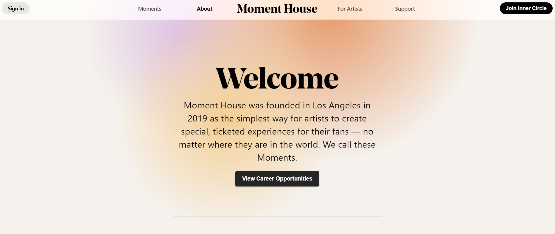
Gaussian blur is also an excellent way to make the main content of your website pop out. The blurred background lets you highlight important content in a creative and unique way that’s sure to catch your site visitor’s attention. Take a look at this stunning artist website template for WordPress below for instance.
So, if you are looking for unique ways to highlight your content, you can consider Gaussian blur as an effective web design principle to make your website stand out.
Incorporate 3D Visuals, Illustrations & Geometric Designs
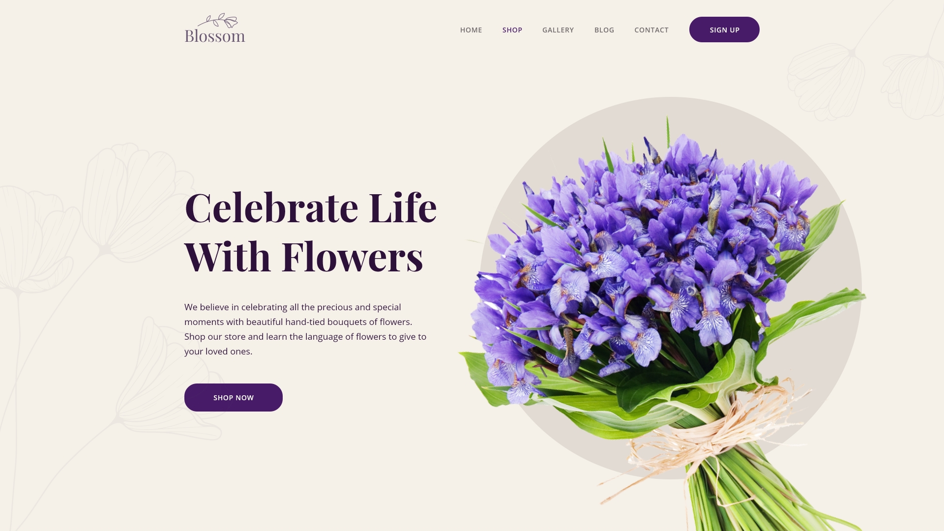
3D visuals, illustrations and geometric designs are often a popular choice for website creators, as they are quite effective at grabbing the reader’s attention. 3D visuals are great for showcasing product images if you are designing an eCommerce website. That’s why, these trends are now being seen in many WordPress website designs of 2023.
![10 Effective WordPress Website Design Principles You Need To Follow [2023] 7](https://assets.wpdeveloper.com/2021/03/ezgif-1-b8430da33909.gif)
Illustrations can also be an excellent way to add a bit of personality to your website, while geometric designs help add some structure to your web pages. So, if you want to create a website that has a distinct personality, you can incorporate 3D visuals with illustrations and geometric patterns into your WordPress website design.

Minimalist, Responsive Designs For All Devices
Simple, minimal designs can give your WordPress website a clean, modern and sophisticated appearance. So, whether you are creating a whole new website or revamping an existing one, you can go for simple, minimalist layouts for your WordPress website design.
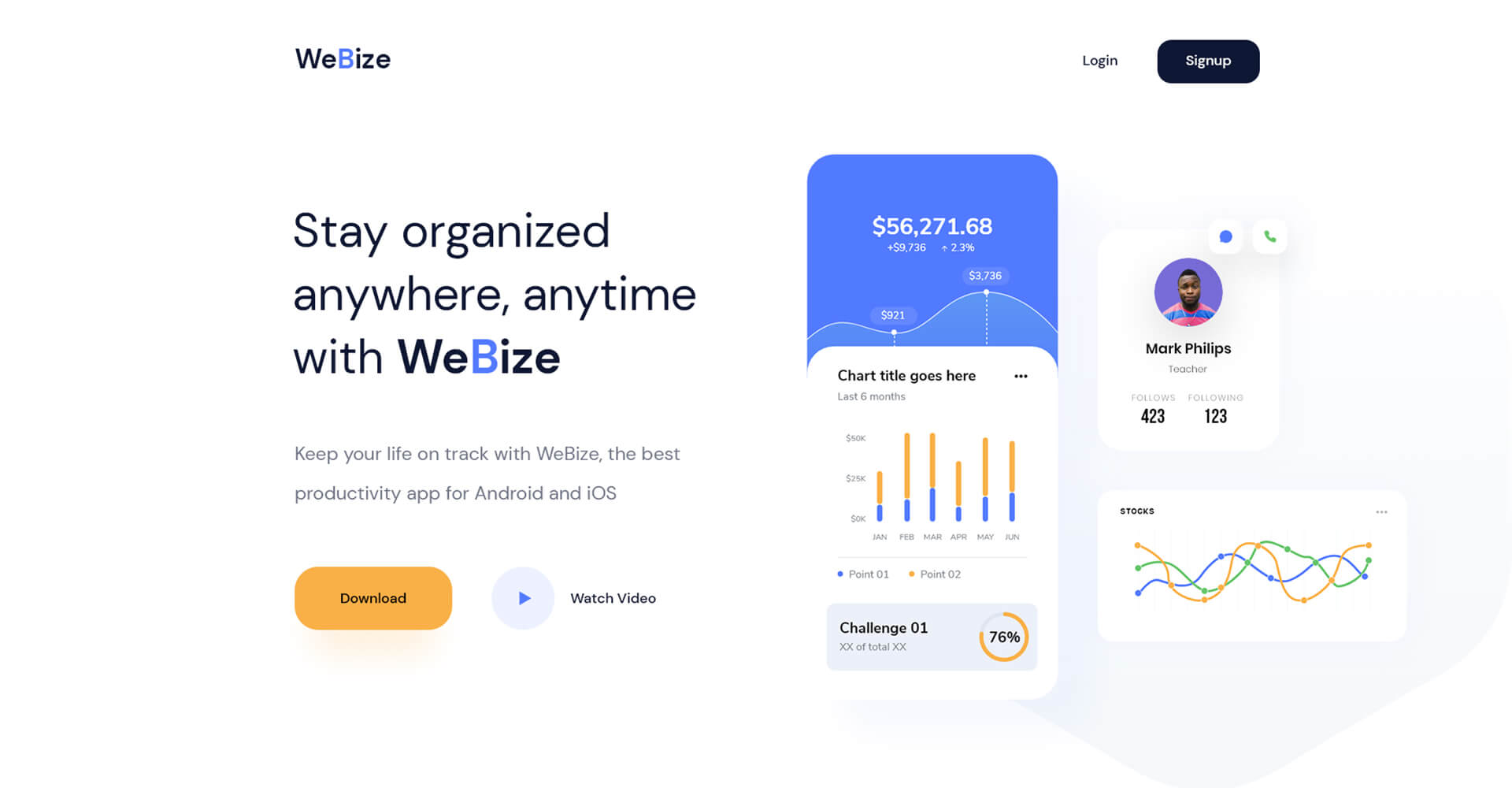
Another important web design principle to consider is to make sure your WordPress website design is fully responsive across all devices. Most people who will visit your web pages may do so through mobile devices, tablets or other devices. And so, it’s very important your WordPress website design is fully responsive across all platforms.
![10 Effective WordPress Website Design Principles You Need To Follow [2023] 8](https://assets.wpdeveloper.com/2021/03/7DG69P8n0F.gif)
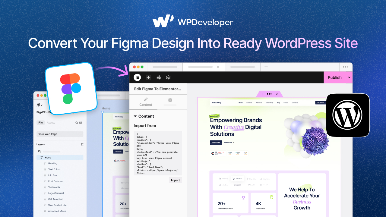
No Code Designs, Page Builders & Template Kits
In the WordPress community, ‘no code’ platforms are growing popular day by day. While these platforms do not exclude the importance of coding, they empower those without technical skills to become a part of the community.
Because of ‘no code’ platforms like the page builder Elementor, anyone can become a website creator if they have the vision, creativity and passion for it.
![10 Effective WordPress Website Design Principles You Need To Follow [2023] 9](https://assets.wpdeveloper.com/2021/03/Elementor-1-Free-WordPress-Website-Builder-Elementor-com.png)
All they have to do is drag and drop widgets anywhere on their web page, and they will instantly be able to create stunning websites in no time at all. Or, they can get beautifully designed ready website templates from and just insert them in their WordPress website.
That’s where Templately comes in. With more than 1000 ready website templates, this is the ultimate templates cloud for WordPress, and it comes with a unique cloud collaboration feature that lets you save and share your designs with your team for faster, enhanced page building experience.
As you can see, there are several effective web design principles that you can follow in 2023 to create websites that are both stunning, functional and accessible. So get ready to start building your dream website today.
Enjoyed this post? Let us know your feedback in the comments below. Don’t forget to subscribe to our blog for more fun tips and tricks, tutorials, news and updates. You can also join our Facebook group to connect with other WordPress website creators like yourself.

![10 Effective WordPress Website Design Principles You Need To Follow [2023] 1](https://assets.wpdeveloper.com/2021/03/Twenty-Twenty-One-New-Default-Theme-for-WordPress-1.png)
![10 Effective WordPress Website Design Principles You Need To Follow [2023] 6](https://assets.wpdeveloper.com/2021/03/SC-1.jpg)
![10 Effective WordPress Website Design Principles You Need To Follow [2023] 10](https://assets.wpdeveloper.com/2021/04/2559-X1440-2.png)
